← Back to All Work
Insytcity: Empowering data storytelling and data-driven decision-making for users at any experience level.
Democratizing data and a state of the art application to anyone.
InsytCity is a startup that provides state of the art interactive data visualizations for businesses and organizations to view actionable insights and make data driven decisions.
InsytCity is a startup that provides state of the art interactive data visualizations for businesses and organizations to view actionable insights and make data driven decisions.
View Live Work

PROBLEM
Understanding local economic development data can be extremely complex!
Even though such data is widely available, it can be difficult for the average person to make sense of it and use it to make informed decisions. Additionally, the lack of centralization makes accessing and analyzing the data a time-consuming task.
SOLUTION + FINAL DESIGNS
A comprehensive data platform to view 6 different categories of economic and workforce data. Easily accessible and navigable.

Data for Storytelling
- Data visualizations for 50+ graphs across 6 categories including overall economic development, people, economy, society, place, and governance data.

Data for Understanding
- View expert explanations in the visualization card itself.
- Hover over any data point to get further insights on the data and information.
- Easily search with the search bar to narrow down and find the exact data topic you are looking for and drill down into that data.
- Hover over any data point to get further insights on the data and information.
- Easily search with the search bar to narrow down and find the exact data topic you are looking for and drill down into that data.

Data for Decision Making
- Share presentations and reports to key stakeholders by downloading/exporting any visualization card to PNG, PDF, or PTT.
- Download the raw data for data driven insights + greater impact
- Download the raw data for data driven insights + greater impact
MOTIVATION
The founders came to us with a vision but no idea how to execute on strategy and design.
InsytCity wants to make it possible for anyone to become an informed user of local economic data. They expect that elected officials, economic development organizations, and individuals outside the field of economics will find this tool useful for making informed business and policy decisions. The founders provided us with some rough designs for their idea, but gave us creative freedom to explore.


COMPETITIVE ANALYSIS
Analyzing other data visualization dashboards that operate on a local and national scale.
I looked at other dashboard tools to get an idea of data dashboards, see what was going well with their product, and identify any gaps for opportunities and value add. InsytCity's target audience focused first on San Diego based data and as their company matures, would broaden and expand data to feature other cities as well.
E-Impact
DataUSA

- No code data visualizations
- Custom data dashboards depending on your city and data points
- Inability to interact directly with the dashboard yourself
- Unknown turnaround, having to wait for the dashboard to be made for you


- 100's of categories and data points to explore
- Interactive data visualizations
- Export the raw data and the visualization
- Can be very overwhelming for new or beginner data users
- Not specialized in a specific industry
PRIMARY RESEARCH
Surveying 27 civic leaders, data experts, directors, managers, researchers, and assistants...
I created a survey consisting of questions that would gather more insights in to how users are finding relevant data, exploring that data, and applying it to their work. We wanted to find out what was difficult about interacting with that data and how we can make that process easier via a simplified dashboard tool.
💡 How are users currently finding data necessary for their job responsibilities (for presentations, decision making)?
16/27 use existing validated data sources (Census, Bureau of Labor Statistics, Public Health Departments)
3/27 scrape the data by themselves either manually or through a script
8/27 simply connect with subject matter experts on their team and ask for relevant data
💡 How did users perform on data exploration tasks? We measured this displaying 3 examples of data visualizations (easy, medium, hard) and asking various questions:
- What is the purpose of this visualization?
- How easy was this experience, in terms of identifying the correct data point and navigating through the visualization?
- How confident did you feel in your ability to interpret the data visualizations you found?
- How easy was this experience, in terms of identifying the correct data point and navigating through the visualization?
- How confident did you feel in your ability to interpret the data visualizations you found?
Easy Dashboard
24/27 were able to correctly identify the purpose of the visualization and were confident in navigating the data.
24/27 were able to correctly identify the purpose of the visualization and were confident in navigating the data.
Moderately Difficult Dashboard
18/27 were able to correctly identify the purpose of the visualization and were confident in navigating the data.
18/27 were able to correctly identify the purpose of the visualization and were confident in navigating the data.
Difficult Dashboard
18/27 were able to correctly identify the purpose of the visualization and were confident in navigating the data.
18/27 were able to correctly identify the purpose of the visualization and were confident in navigating the data.
CUSTOMER JOURNEY MAP
Visualizing touch points and potential pain points.
I role played a persona's user journey to get an idea of what it actually takes to find the actual data that is necessary for a project, for example, searching for statistics on income vs employment, then interacting with a data product/platform, and how a persona uses those findings for their work.

Identifying patterns and trends -> Generating insights
Simplifying Complexity
Users wanted full capabilities of a typical dashboard tool, but would appreciate an easy to use dashboard.
"I struggled with collapsing down to the appropriate data scale. Less diverse regions were more easy to navigate."
"Getting overwhelmed by the number of visuals on a page."
Stakeholder Management
Our users utilize data they gather for a number of reporting, presentations, and decision making.
"My biggest struggle is building dashboards for stakeholders, not usually navigating one"
Narrowing in on Specific Data and Insights
What users valued is seeing both the high level data overviews, as well as looking into more granular data.
"I struggled with trying to get to more detailed/specific data points that were inputs into the overarching dashboard calculations."
Interactivity
Users simply didn't want visualizations that were static. Interacting with the data is key for their use cases.
"Ability to use interactions and animation to do A/B comparisons of data that is subject to various filters."
"The most essential features are filters, interactivity, digging into the raw data."
PROBLEM STATEMENT
How might we create a data dashboard tool to help businesses and and civic leaders leverage local economic development data in order to increase understanding of data and improve the impact of data-driven decision making?
REVIEWING TECHNICAL SPECIFICATIONS
Information architecture
First, our client provided us with a site map for how the product should flow. Our team then revised it to ensure we have all the pages and functionality correct. We would be designing both the landing pages and the actual product.

IDEATING SOLUTIONS
Designing a complex data product that's beginner friendly and captures a wide range of data explorations...
We mapped out a bunch of user flows, thinking about how an employee would typically search for data, and imagine how that would look on the InsytCity web app. We drew inspiration from our previous competitive analysis to envision the user flow. One thing unique to InsytCity is that we would need to have both Administrative and User roles, but for the client-facing user product, I just focused on mapping out the Customer/User experience.

Brainstorming sessions with the team
Our team struggled heavily during this stage. Thinking about how to incorporate many different features and aspects into a 1 month design sprint was not working in our favor. But thankfully, we had many brainstorming and white boarding sessions where we just threw everything at the wall and saw what would stick...
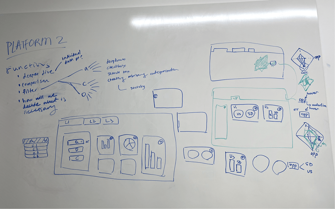
Finally getting to concept creation -> sketching and lofis
We came up with some initial sketches of the dashboard to visualize how the product would flow. On the main page, users can toggle between different views, meaning different visualizations, and also apply any filters on the left hand navigation bar.
SKETCHES

LOFIS - VERSION 1


Initial lofi-designs lacked direction -> further refinining them
As our team created the first versions of the low fidelity prototype, we quickly realized that the flow between each of the screens didn't make the most sense. From the first iteration, certain use cases weren't considered and so the filter options we listed didn't capture enough data options. We also didn't exactly translate what we wanted onto screen, and so our first designs lacked clarify and focus.
To iterate on the designs and make sure we had an excellent foundation before moving onto hi-fidelity designs, I suggested we take on a more traditional dashboard layout, with clear tabs and categories at the top which users can navigate through. I utilized my skills from data analytics classes I took and fell back on the research we conducted as a team to design the most intuitive dashboard for the low fidelity design.
To iterate on the designs and make sure we had an excellent foundation before moving onto hi-fidelity designs, I suggested we take on a more traditional dashboard layout, with clear tabs and categories at the top which users can navigate through. I utilized my skills from data analytics classes I took and fell back on the research we conducted as a team to design the most intuitive dashboard for the low fidelity design.
LOFIS - VERSION 2


IMPROVING DESIGN EFFICIENCY
Leveraging an existing design system
Our team thought it was virtually impossible to design data visualization elements completely from scratch (graphs, bar charts, scatterplots, heat maps, etc) in only 1-2 weeks. We decided to use an existing design system to make sure our visualizations were consistent with each other. This would also help heavily speed up our designs, making our process much more efficient! Thank you to Tre Wilson - Data Visualization Package for providing this amazing resource!
Our sad attempt at trying to create data visualization components...

-> Now using the free package of data viz UI components!

DESIGN ITERATIONS + USABILITY TESTING
Making revisions based on feedback -> Mid Fidelity Designs
We conducted some initial user testing with 8 people to gather insights on what features seemed the most intuitive on the design, see if the flow of the design was seamless, and identify any blockers. At this time, discussions with the client and also our project manager guided certain design changes we made to the data dashboard.
1. A robust filter to optimize data explorations and to consider all edge cases
Initially, our team went back and forth on a a specific filter feature. Additionally because conversations with our stakeholders mentioned that the data visualization app wasn't meant to be 100% customizable in all the different data points. However, re-evaluating with all the research we conducted in the competitive analysis and with the surveys and interviews, a filter system was explored. This was something that had to be discussed with the tech team because we weren't sure if all the data would be available within their web app, depending on what data sources and data sets they had access too.

- Search field by text allows for many options to be displayed
- Search field likely has to have precise inputs in order to pull up relevant data
- Search field would only be for topic or title of the visualization.
- Top section takes up a lot space

- Filter button with the option to filter by date range and states and regions
- Kept the search field to be able to search by title or data topic
2. Minimizing the number of visualizations on the screen
As a data visualization product, we want the focus to of course be all the different visualizations. With general feedback from users, we noticed a higher percentage of interaction when there were a limited amount of cards on each page. Compared to a page with 5-6 different visualizations, only having a few allows the user to view more in depth visualizations. Of course, there would be more cards displayed on the page that can be viewed if a user scrolls, but our team decided only displaying 1-2 large visualizations was the way to go.

- High level overview of different data and visualizations. Can capture the many different visualizations displayed
- Cluttered
- Can be overwhelming, user doesn't know which to look at first

1 Card/Visualization

2 Cards/Visualizations
- Spotlights only a few important visualizations at a time
- Less cluttered
- Easier to read text on each visualization card +1 for accessibility!
- More room to interact with the visualization, can better hover over a data point to see expert explanations.
3. Top and Side Navigation
Goodbye tab navigation bar, you will be missed :( Pro tip to not get too attached to your ideas and the designs you prefer. Listen to your users!!
Users felt overwhelmed with essentially 2 different navigation systems. Instead, we decided to just centralized everything into a sidebar navigation to ensure clarity and distinction between all the data categories.
Users felt overwhelmed with essentially 2 different navigation systems. Instead, we decided to just centralized everything into a sidebar navigation to ensure clarity and distinction between all the data categories.

- Concise tab navigation
- Tab navigation bar could only include a max of 6 tabs, not scalable
- Overwhelming to have all data categories at the top of one page
- Filter and search bar are in awkward places
- Top section takes up a lot space

- Main categories moved to the side for clearer designation
- Less visual clutter on main visualizaton page
- Room for additional categories of data in sidebar nav
- More real estate for actual data visualizations
- Better focus on filter and search options
DESIGN SYSTEM
Style guide and designing efficiently with components

REFLECTION
My first ever client project
Working on a large scale impactful product
Communication with the founders and key stakeholders were absolutely key. We wanted to make sure we were all on the same page and I learned to manage client expectations in all of our discovery calls and strategy sessions. I also learned how to manage scope creep with my team. Overall, this project was a huge learning experience for me as this was the first client project I worked on with a real digital solution that will be shipped!
Learning to work with teammates in a remote and in-person capacity
At the beginning of our project, work was split up and completed individually and asynchronously because we were on our winter break. We found that this method wasn't working for us because we weren't able to brainstorm, make decision decisions, or move forward together. Halfway through the project, we decided to meet in person to have coworking session time to better work through our project! This improved our efficiency A LOT and we had better communication for the rest of the project!